This article is the second part of our deep dive into the urban sustainability indices. In the first part, we explored what these indices aim to measure. In this continuation, we critically examine the methodological challenges.
Best urban sustainability indices: the politics of measurement
Behind the sleek rankings and color-coded maps of the best urban sustainability indices lies a dense forest of methodological decisions—each with its own assumptions, limitations, and consequences. These frameworks attempt to translate the complex, multidimensional concept of sustainability into simplified tools for global comparison. But how exactly do they do this—and at what cost?
Constructing a sustainability index is as political as it is technical. Each methodological choice—from indicator selection to weighting—reflects underlying assumptions about what matters, who decides, and how success should be defined. While these indices can inform, inspire, and diagnose, they should not be mistaken for objective verdicts. As we assess the cities they rank, we must also scrutinize the frameworks that produce those rankings.
How indices are usually built
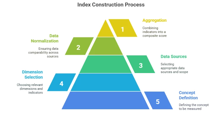
Creating an index typically involves the following steps:
1. Defining the concept or objective to be measured.
2. Selecting dimensions and indicators.
3. Choosing data sources and scope.
4. Normalizing data to ensure comparability.
5. Weighting and aggregating indicators into a composite score.
Each of these steps introduces subjectivity. For example, decisions about which indicators to include, how to normalize data, or how to assign weights are inherently value-laden. That’s why the question ‘what are we measuring?’ remains crucial.
Indicator selection: what counts and who decides?
Sustainability is a broad and contested concept. Most indices define it through selected dimensions—typically environmental, social, economic, and governance-related.
However, the selection process is often opaque. Most indices do not clearly explain why certain indicators were chosen or how stakeholder input was considered—if at all.
For example, the selection criteria for the indicators used in the Arcadis SCI are not fully disclosed. While Arcadis often states that the indicators are based on desk research and expert consultation, no detailed documentation of the decision-making process, stakeholder involvement, or indicator validation procedures is publicly available.
Data collection: between what’s available and what matters
Data sources typically include international databases (World Bank, UN-Habitat), municipal open data, consultancies, satellite imagery, and surveys. Because city-level data is often inconsistent or unavailable, indices use proxy indicators—like GDP per capita for economic health or car ownership for mobility. These proxies may oversimplify complex realities.
Cities with robust data systems (often in the Global North) tend to perform better—not necessarily because they are more sustainable, but because they are more measurable.
For example, the IESE Cities in Motion Index (CIMI) includes over 180 cities worldwide, but data consistency and reliability vary significantly across regions. The methodology does not clearly explain how differences in data availability are addressed or whether the data are harmonized.
Normalization: making apples comparable to oranges
To compare diverse indicators—such as CO₂ emissions and literacy rates—data must be normalized. Methods include min-max scaling, Z-scores, and rank-based scoring. While necessary, these techniques can distort results. Outliers can skew min-max scores; rankings can ignore magnitude differences.
The biggest issue is the lack of transparency. For example, while Arcadis SCI normalizes to a 0–100 scale, it does not disclose formulas, reference values (e.g., minimums and maximums), and assumptions behind scaling. This lack of openness undermines reproducibility and trust.
Weighting and aggregation: whose priorities count?
Assigning weights to indicators is one of the most contested aspects. Some indices use equal weights; others rely on expert input or statistical models. But all involve value judgments that shape the outcome.
Most indices don’t provide alternative weight scenarios or allow users to adjust weights. Composite scores—often based on simple averages—can obscure important trade-offs.
The authors of the Corporate Knights Sustainable Cities Index, for example, do not fully disclose, how indicators are weighted. The methodology summary provides only limited insight into whether weights are empirically derived, expert-informed, or arbitrarily assigned. As with many indices, CK-SCI appears to use additive aggregation, allowing strong performance in one category (e.g., pollution and emission) to offset poor performance in another (for example open public space), thus hiding critical weaknesses.
Static snapshots vs. dynamic progress
Most indices present annual snapshots. While helpful for comparison, this approach ignores change over time and resilience to shocks. A city improving rapidly may rank lower than one that is stagnant but historically strong.
To partially address this issue, the Arcadis Sustainable Cities Index (SCI) introduced a fourth dimension in 2024: Progress. This new pillar aims to measure long-term sustainable development using key indicators from the Planet, People, and Profit categories that can be tracked over a 10-year period.
Based on this dimension, the authors identify four groups of cities:
- Cities that perform well across both the core SCI pillars and the Progress pillar.
- Cities that perform well in the core SCI pillars but less so in Progress.
- Cities with high Progress scores but low rankings in the core SCI pillars.
- Cities that rank low in both the core and Progress dimensions.
However, the addition of this dimension introduces some methodological inconsistencies and complicates longitudinal comparisons. For example, in 2024, Beijing received a total score of 20 and 7 in Progress, yet scored 67 in the Planet dimension, 31 in Profit, and 27 in People.

Composite scores: clarity or concealment?
While composite scores simplify communication, they can also obscure nuance. Indices like Arcadis SCI (67 indicators) and IESE CIMI (100 indicators) compress complex realities into single numbers. This can reduce analytical depth and risks misleading interpretations.
Composite scores can:
• Hide internal contradictions (e.g., clean energy but poor social equity)
• Enable strategic gaming (cities targeting high-weight indicators)
• Suggest false precision across fundamentally different urban contexts
A more transparent approach would prioritize indicator-level visibility through interactive dashboards or modular reporting.
What is next
As this analysis shows, even the best urban sustainability indices are constrained by methodological ambiguity, value-laden decisions, and data limitations. While they offer useful benchmarks, their results should be interpreted critically.
In the next part of this series, we will give some examples of cities deprived by the urban sustainability indices. We will also focus on practical their use of the indices, offering guidelines for selecting and using them responsibly in policy and planning. Stay tuned.
You can also read more about the principal questions of sustainable development here and about the different aspects of sustainable urbanization here.